French Riviera posters: the Belle Époque Riviera on your walls
Nice, Cannes, Antibes, Saint-Tropez. The French Riviera inspired the most beautiful travel posters of the 1920s to 1950s. Here’s the guide to putting it on your walls without falling into postcard territory.

Key points
- 60 posters in the French Riviera posters collection, the 20 from this article in the table below.
- From 83,00 zł in A4, up to 320,00 zł in A0, 5 sizes for each poster.
- Printed in Europe on demand, free delivery from €59.
The table
The 20 posters at a glance
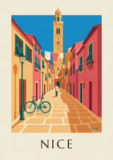


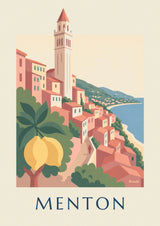


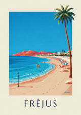
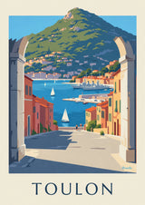


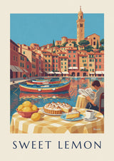


The French Riviera isn’t a beach with a towel on it. It’s a myth built over 40 years by poster artists who had to convince wealthy Parisians to take the PLM train all the way to Nice. What they produced between 1900 and 1960 remains the grammar of chic travel. Here’s how to bring it to your walls without drifting into tourist souvenir territory.
3 graphic currents coexist in vintage Riviera art. The legendary chic of the pre-war years (palaces, ocean liners, golf courses), the seaside spirit of the first paid vacations (beach cabins, striped parasols, Art Deco bathers), and postwar modernity (glamorous Cannes, Bardot-era Saint-Tropez). Choosing one means setting a very specific mood.
As for placement: above a bottle-green velvet sofa, in a navy bedroom, or in an entryway to set a “South of France” tone the moment you walk in. A1 is a must for impact, with a light wood or aged brass frame. See our French Riviera posters collection.
The French Riviera, a place posters invented
Before it was a destination, the French Riviera was a promise. A promise of sun, seaside strolls and white palace hotels, sold by the railway companies to a cold-weary clientele in Paris, London and Saint Petersburg.
Between 1880 and 1960, the PLM company (Paris-Lyon-Méditerranée), then the SNCF, commissioned several hundred posters to draw that clientele south. Hugo d’Alesi, Roger Broders, Cassandre, Charles Léonce Brossé: the greatest names signed images that still define our imagination of the coast.
What makes these posters timeless is their graphic efficiency. No superfluous detail, no crowded typography, just the silhouette of a town set between a sea that’s too blue and a sky that’s too warm. That simplicity is why they age so well in a contemporary interior.
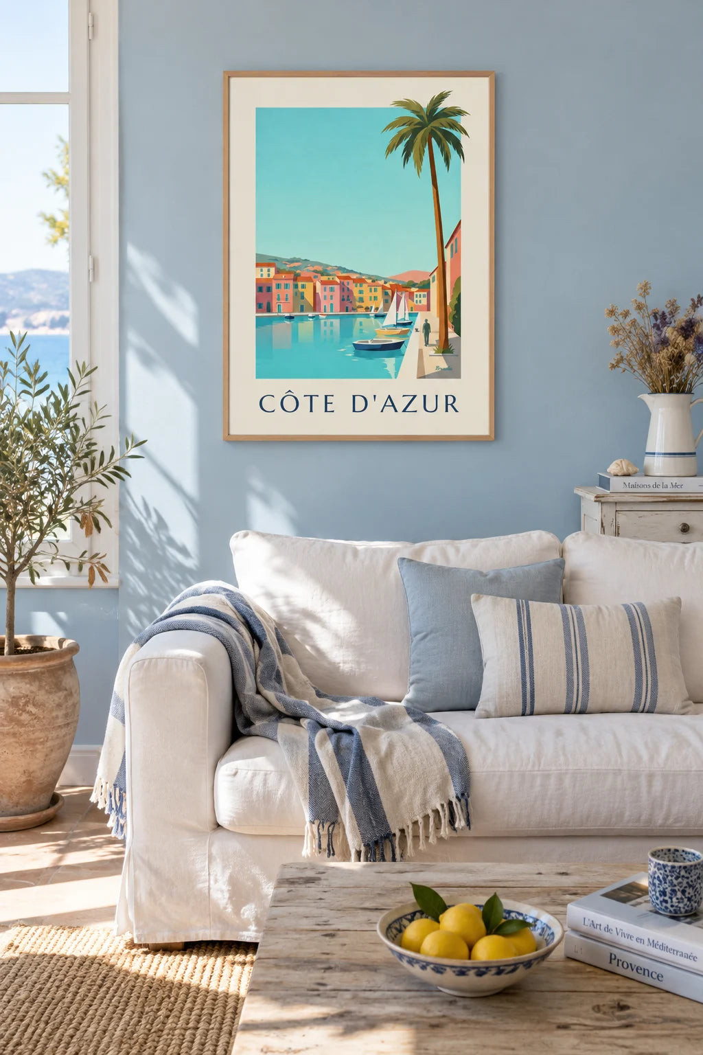


6 destinations, each with its own palette
Nice, Promenade des Anglais blue
Nice is the Baie des Anges, its palm trees and the bright pink Hôtel Negresco. On Broders and Cazals posters, the city is often boiled down to 3 elements: the curve of the Promenade des Anglais, the turquoise sea, and Mont Boron closing off the horizon. A Nice poster works best in a room where blue already dominates.
Cannes, Croisette orange
Cannes plays on contrast: cobalt sea against the pastel, ochre and powder-pink facades of the Belle Époque hotels along the Croisette. The Carlton and the Majestic appear on most posters. A warmer palette that pairs well with an old parquet floor and cognac leather.
Saint-Tropez, harbor turquoise
Vintage Saint-Tropez has nothing to do with today’s Saint-Tropez. It’s a small fishing port with ochre and pink houses, painted boats and a pastel church. Posters from before 1970 show a village. For anyone who wants to avoid the flashy side of the modern resort, this is the one.
Antibes, Monaco, Menton
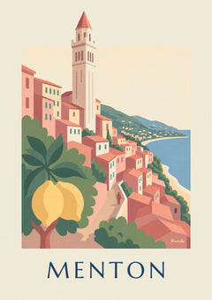
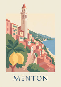
Antibes focuses on Fort Carré and the calm sea, Monaco on the casino and the Rock, Menton on its lemon trees and its row of pastel facades. All 3 are less represented than the stars, which makes them more interesting if you want a poster your neighbor won’t have.
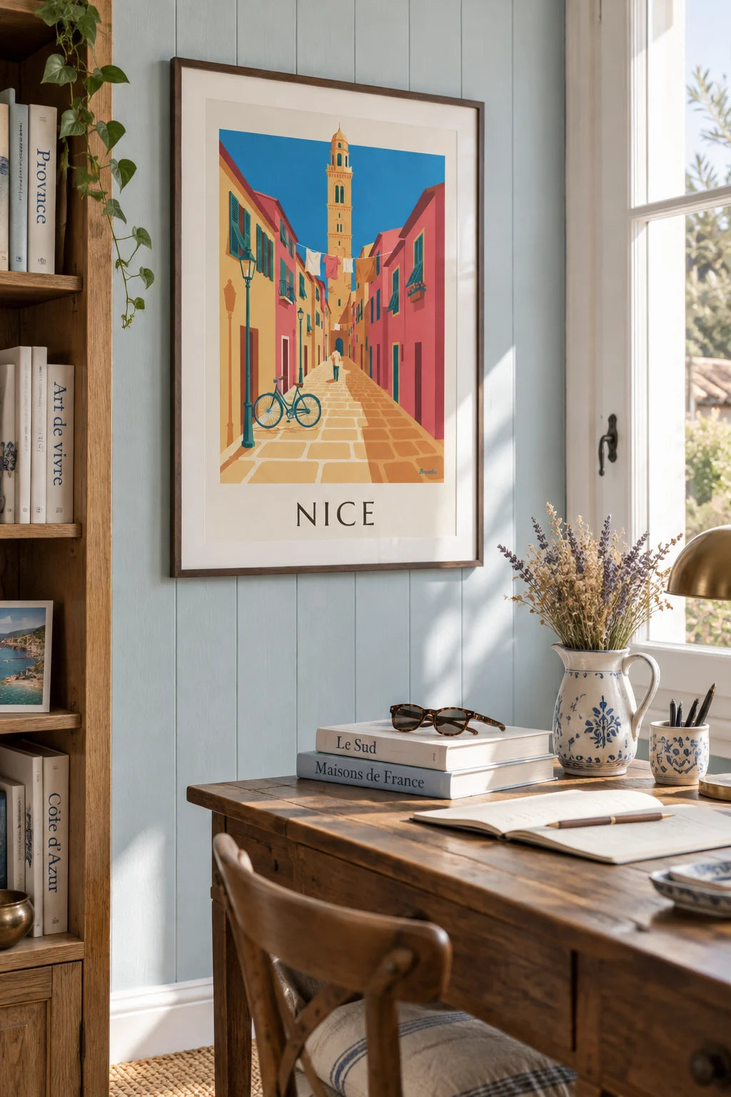
3 ways to style it on a wall
The Riviera triptych
3 A3 posters from the same era (for example 3 Broders from the 1930s) lined up above a sofa. The consistency comes from the shared graphic signature. Leave 4 cm between frames and align the top edges perfectly.
The solo centerpiece
A single A1 poster (60 x 84 cm), well framed and centered above a low piece of furniture. If the wall is wide, don’t try to fill it: the space around the poster is part of the composition.
The asymmetrical gallery wall
5 to 9 French Riviera posters in different sizes, mixed with 1 or 2 black-and-white photos of the same region. The black-and-white neutrals rest the eye between bursts of color.

The right frame for a sunny palette
Light wood for a Scandinavian feel, aged gold for the Belle Époque, dark walnut for Art Deco. Avoid black metal, which dulls the light specific to these posters, and glossy white, which looks like an airport gallery.

Build this wall
3 posters from this article, at true scale


All 3 posters: 457,00 zł
Frequently asked questions
You often ask us
Which cities should I choose for French Riviera posters?
Nice, Cannes, Antibes, Saint-Tropez, Monaco and Menton are the 6 classics. For a cohesive gallery wall, choose 3 posters that share the same colors (turquoise, sand, terracotta) rather than 6 cities treated differently.
Are French Riviera posters kitsch?
Not if you steer clear of modern tourist prints. A Belle Époque or Art Deco poster (1920 to 1950) stays timeless because it was designed to sell travel to the elegant, not to tourists.
What size is best for a French Riviera poster in a living room?
A2 (42 x 59 cm) is the perfect anchor above a sofa. A3 (29 x 42 cm) works as a triptych (3 cities in a row). A1 (59 x 84 cm) works as a solo centerpiece.
Which frame should I choose for a French Riviera poster?
Light wood or aged gold. Blond wood pulls the palette toward Scandinavian, while gold reinforces the Belle Époque feel. Avoid black metal, too harsh for this sunny palette.
Do my French Riviera posters suit a modern interior?
Yes, that’s actually where they work best. On a white wall, next to clean-lined furniture, the poster becomes the element that warms the room and tells a story.
Keep exploring